Before:
 |
| This had problems; the original was worse |
Not a lot to complain of, except that the main character featured on the cover was a man, without a doubt, and the kohl around the eyes and the truly bizarre hair – even to those like me who are somewhat familiar with the society makes you doubt it.
I had wanted it to be moving, the tears in the eyes – the story arises from a bereavement – but while I liked the composition and the color, I had to admit to myself (at the very least) that this was wretched and needed to be adjusted.
I liked the colors and the composition, and, as with the other designs in the cycle, I liked using statuary (in this case a bas-relief) that had some connection with the characters.
The hair was problematic, and there were several reasons why I was dissatisfied.
 |
| An improvement, but needs work… |
Tonight I sat down, thought things through, and worked for severael hours. I had an idea for a way to fix things. Doing the hair differently, for starters.
After:
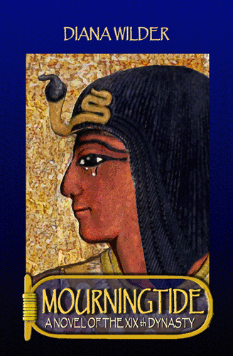 |
| The final version |
Better hair. It looks better. I may lift his chin a little, though he is mourning (hence the title…)
I adjusted it a little this morning and then the connection failed. I’ll upload the ‘final’ version this evening. I made the man larger on the page, and raised his chin, as I had intended.
…and here is the final version. I also removed the hand from the frame, whihc reduced the ‘noise.
One more step taken. *Sigh*. I will miss this story.
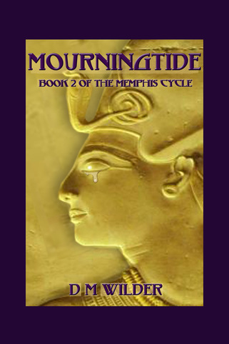
September 6, 2015:
I am editing this to show the final cover. I scrapped the cover image, which I realized was not up to par, and composed a different one completely: